Urban Redesign: In-City Forest
Reimaged Space, Experiential Design
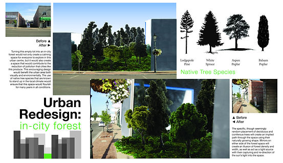
This project was an attempt to redefine what unused or under-used urban spaces in downtown Medicine Hat, Alberta could become.
Downtown Medicine Hat had been experiencing several years of redevelopment and was mainly a place of local businesses and government buildings. I was drawn to an empty lot nestled between two older buildings in heart of the downtown core. I decided that I wanted to create a space that would act as an escape from the formality and business culture that the downtown thrived on.
I often find a personal peace when I get a chance to walk through a wooded area. Being amongst trees makes me feel cozy and content and I wanted to find a way to bring those feelings into the urban landscape. I did a lot of research on arboriculture and looked at case studies regarding cities who focused on maintaining their urban tree canopies. I also learned about the trees which grew naturally in the Medicine Hat area that I knew would be able to naturally thrive in the climate of the region.


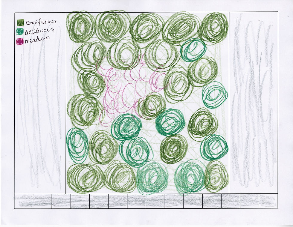
I started my iterative process by drawing out several sketches of what I wanted the space to look like. In order to make the space feel bigger and denser, I wanted to clad the walls of the neighbouring buildings in large mirrors. These mirrors would also capture the sunlight and direct it into the space throughout the majority of the day.
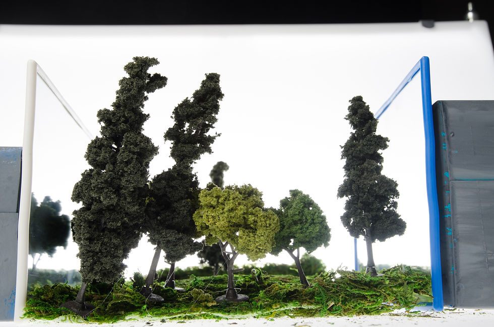
I chose to build a model to help me better understand and explore the feeling of an in-city forest space. I wanted to get a sense of how dense the trees would need to be and how they would need to be arranged spatially. I wanted to ensure that the trees were planted in such a way that would facilitate the correct emotions and energies for someone entering the space.
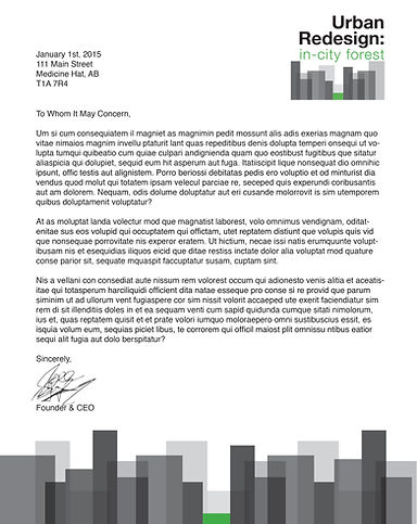
The last element of this project was to create a brand for the hypothetical company that would implement these in city forest spaces. I designed a logo system. The varying grey rectangles acted to represent the every-changing urban environment while the singular green rectangle sat as a calm beacon in the middle of it all. This logo system was adaptable and could expand or contract for use on any format or media such as letterhead.